use case

Enterprise Web App Experience

Overview

Tourmo is a B2B SaaS platform focused on AI-powered mobility operations, helping enterprise fleets monitor, manage, and improve their performance. As the platform grew in complexity, the need for a more cohesive and user-friendly experience became urgent — especially for fleet managers who rely on the system to make fast, data-driven decisions.

I joined the team as a UI Designer to work on a performance dashboard. What started as a focused initiative quickly expanded into a full UI/UX redesign across multiple platform modules. My work contributed to improved visual hierarchy, modularity, and accessibility — bringing clarity to critical workflows. The new design was fully implemented and is now live across the platform.

Client

Tourmo

Role

UI Designer

Duration

9 months

Tools Used

Figma

Understanding the Challenges

As the platform evolved, users began facing several usability and performance challenges that impacted daily operations. Based on internal reviews, product feedback, and team observations, we identified four major problems:

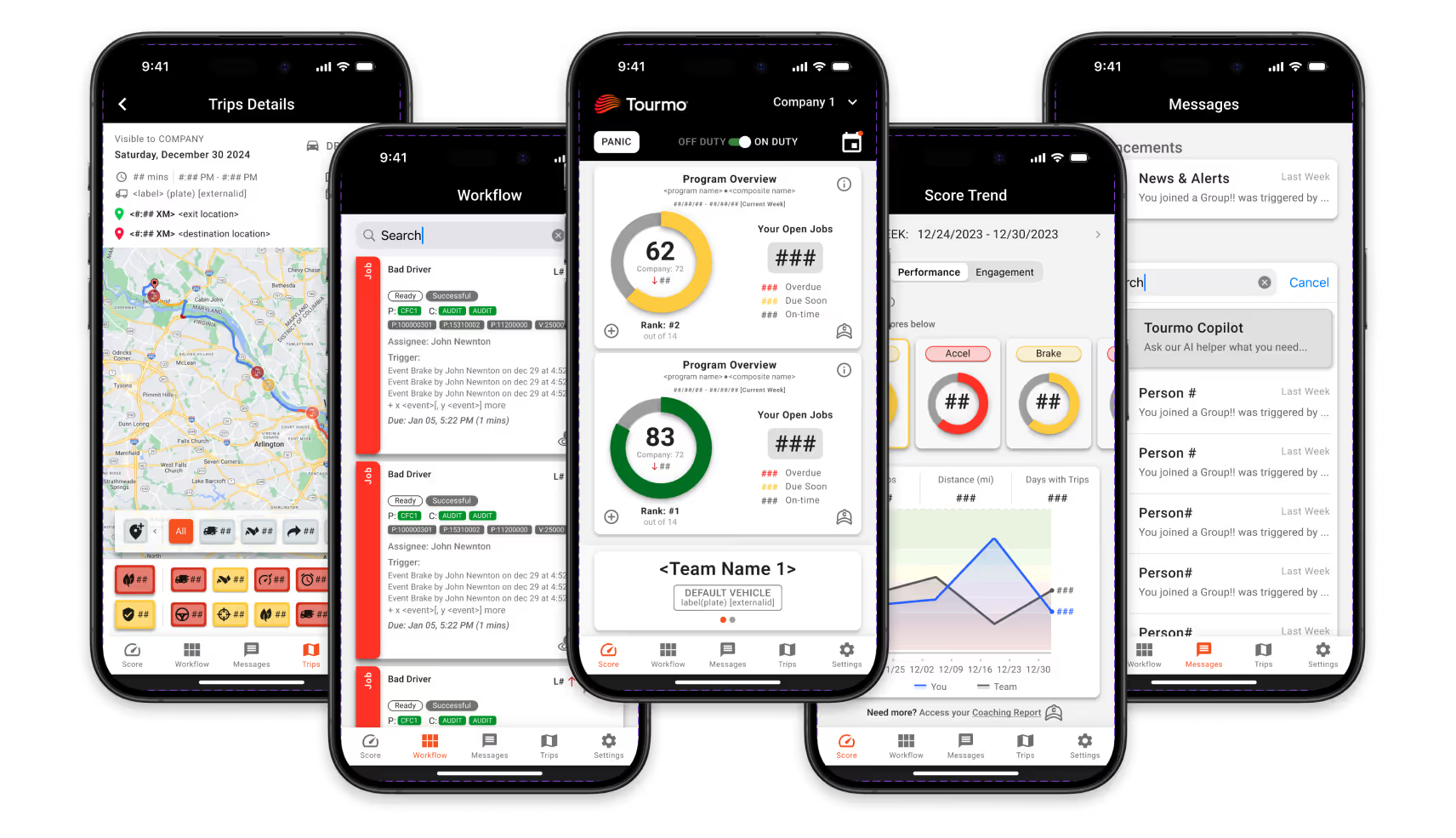
  • Need for Customization in Decision-Making:

    Fleet managers needed a way to tailor the interface to their specific goals and metrics in order to make operational decisions quickly. This led to the creation of a modular dashboard, offering more control and visibility over performance insights.

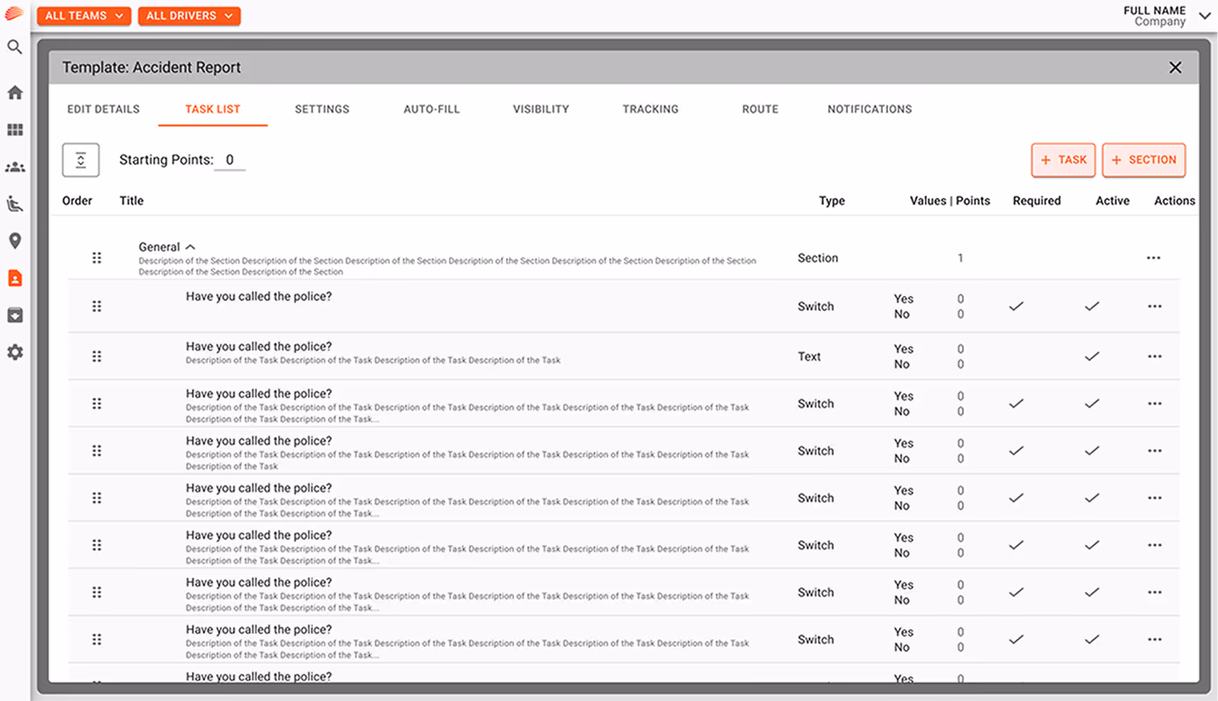
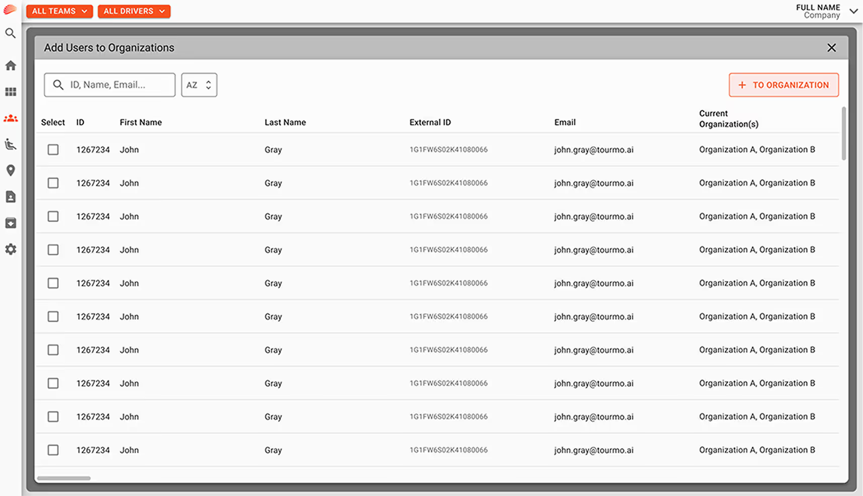
  • Fragmented UI and Inconsistent Visual Language:

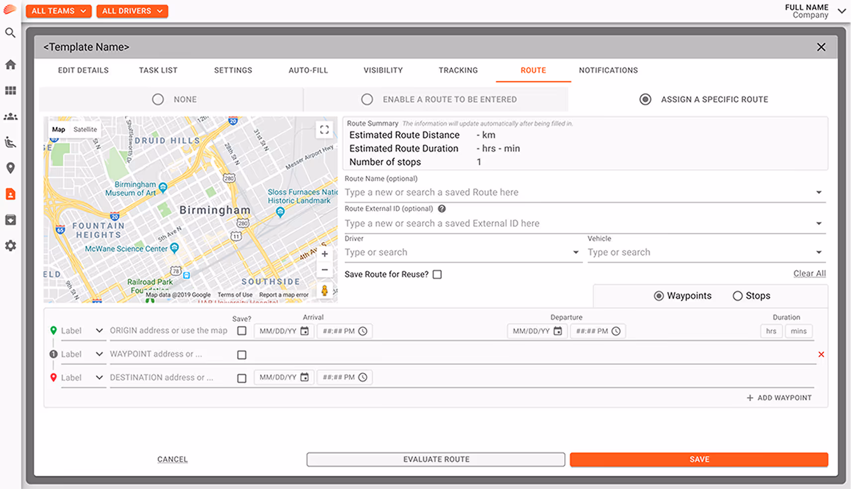
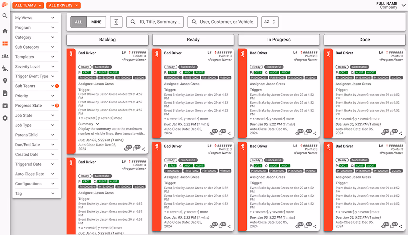
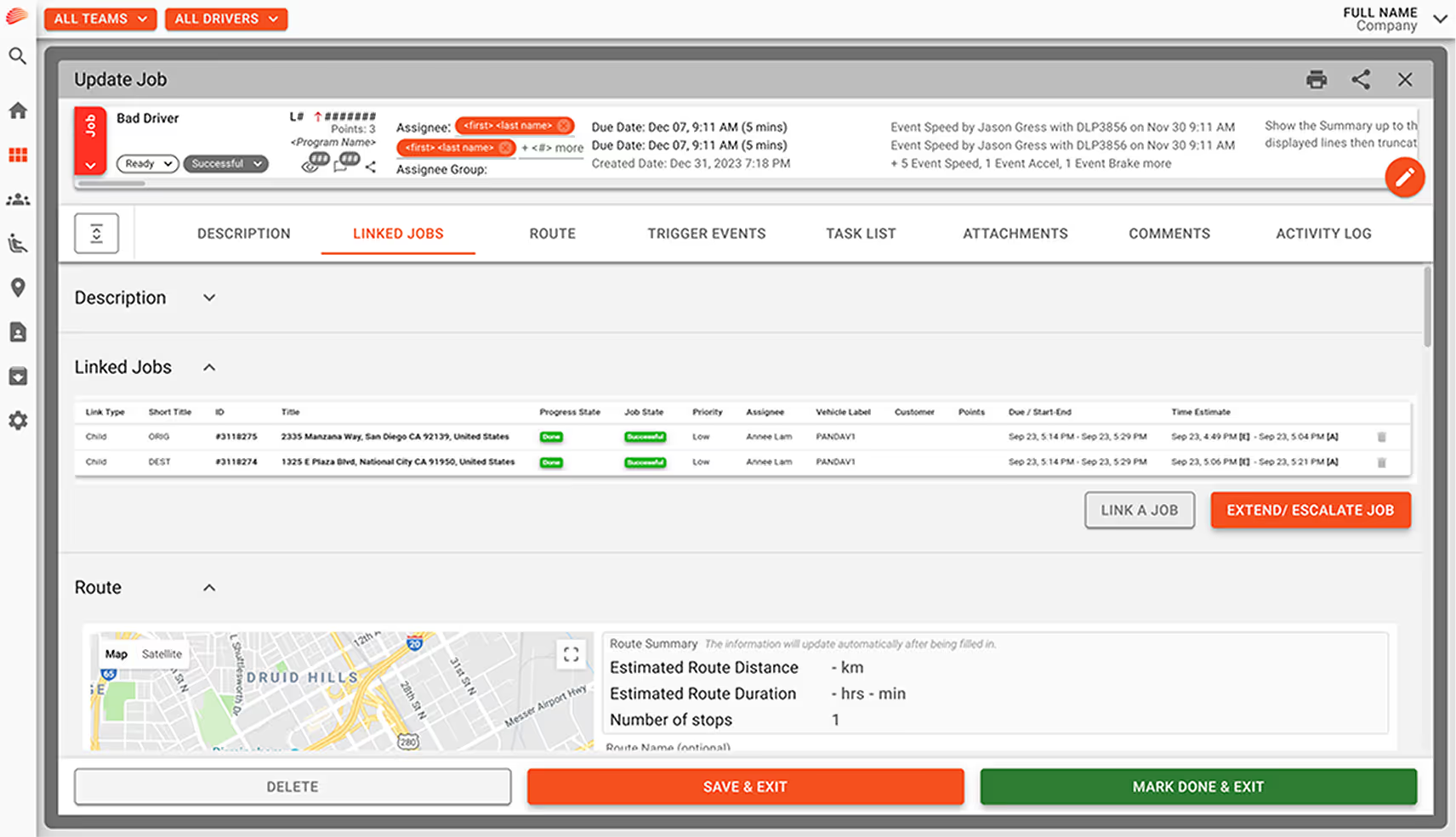
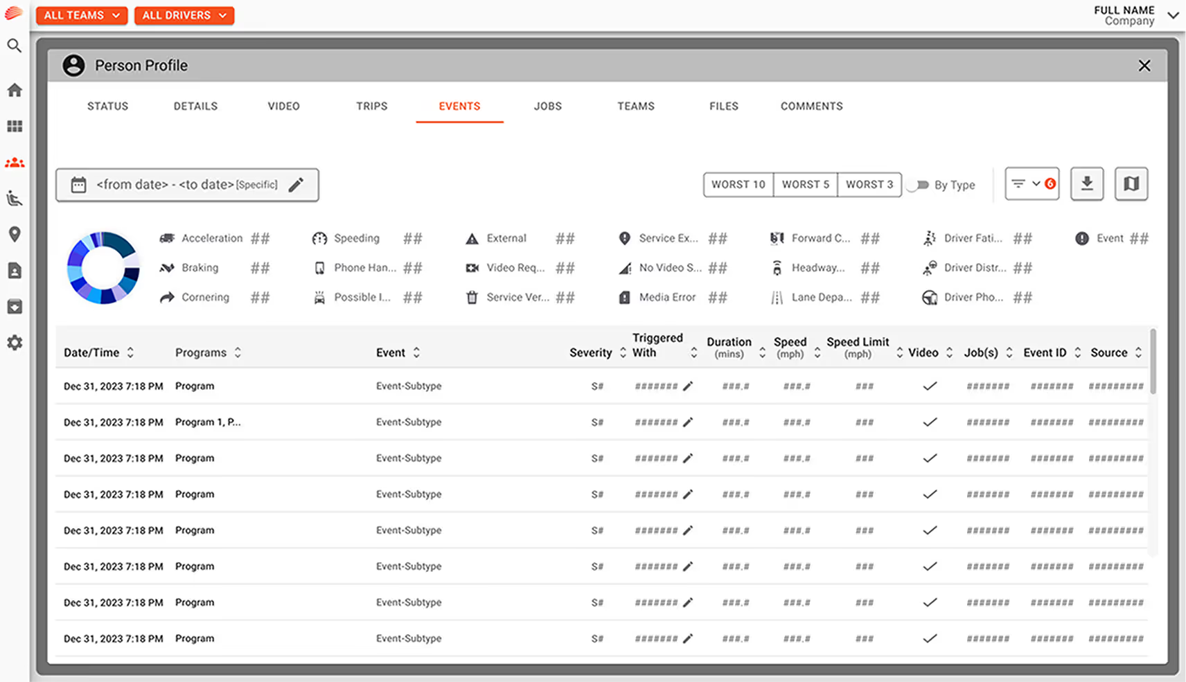
    The platform had grown organically over time, resulting in a patchwork of styles and layouts. Key actions were often hidden, duplicated, or styled differently across modules, making it harder for users to navigate confidently and efficiently.

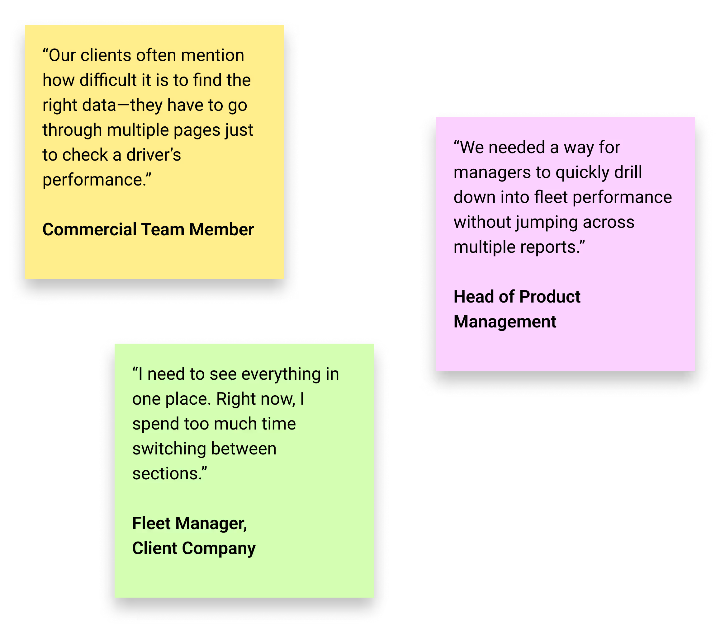
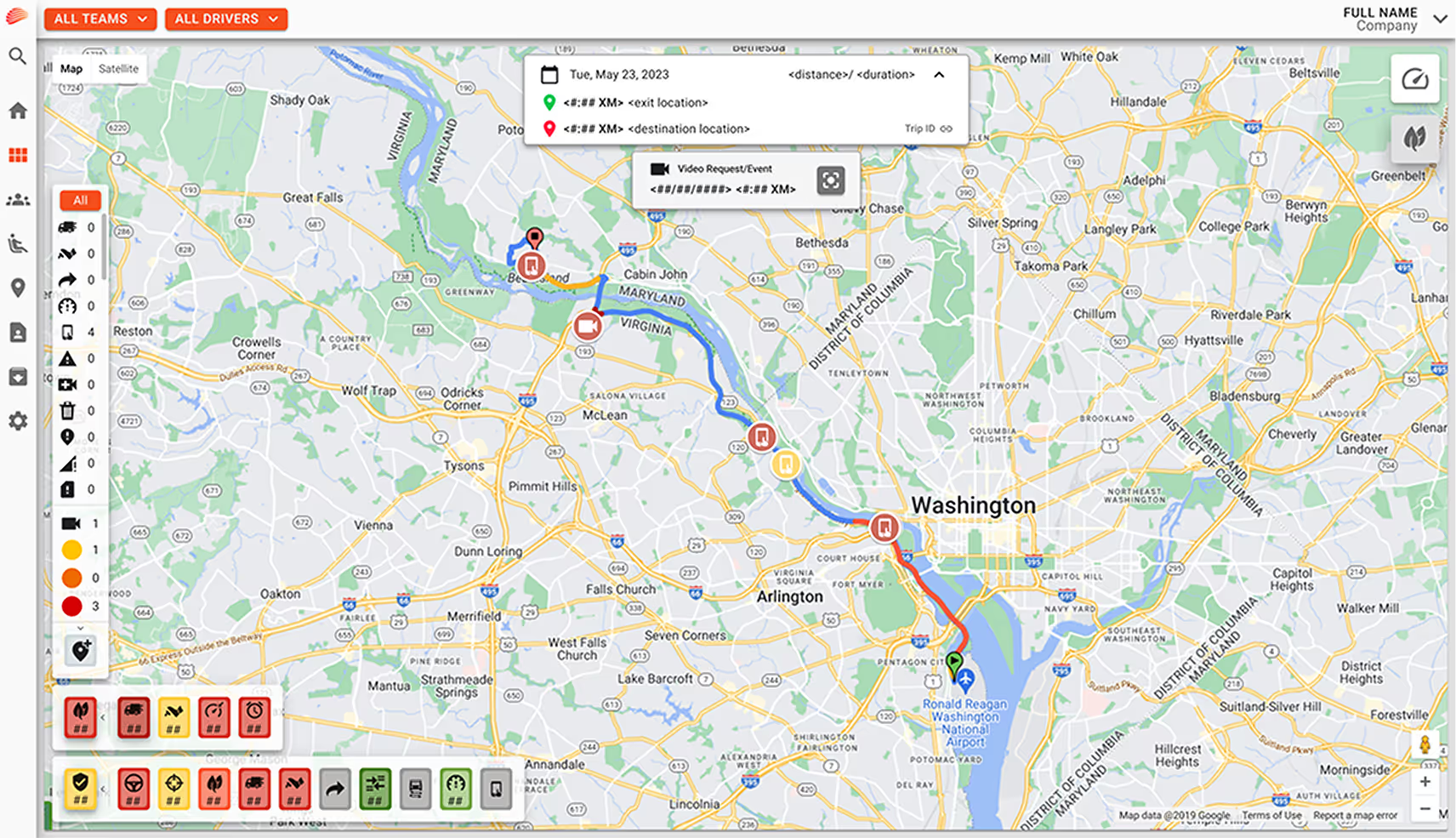
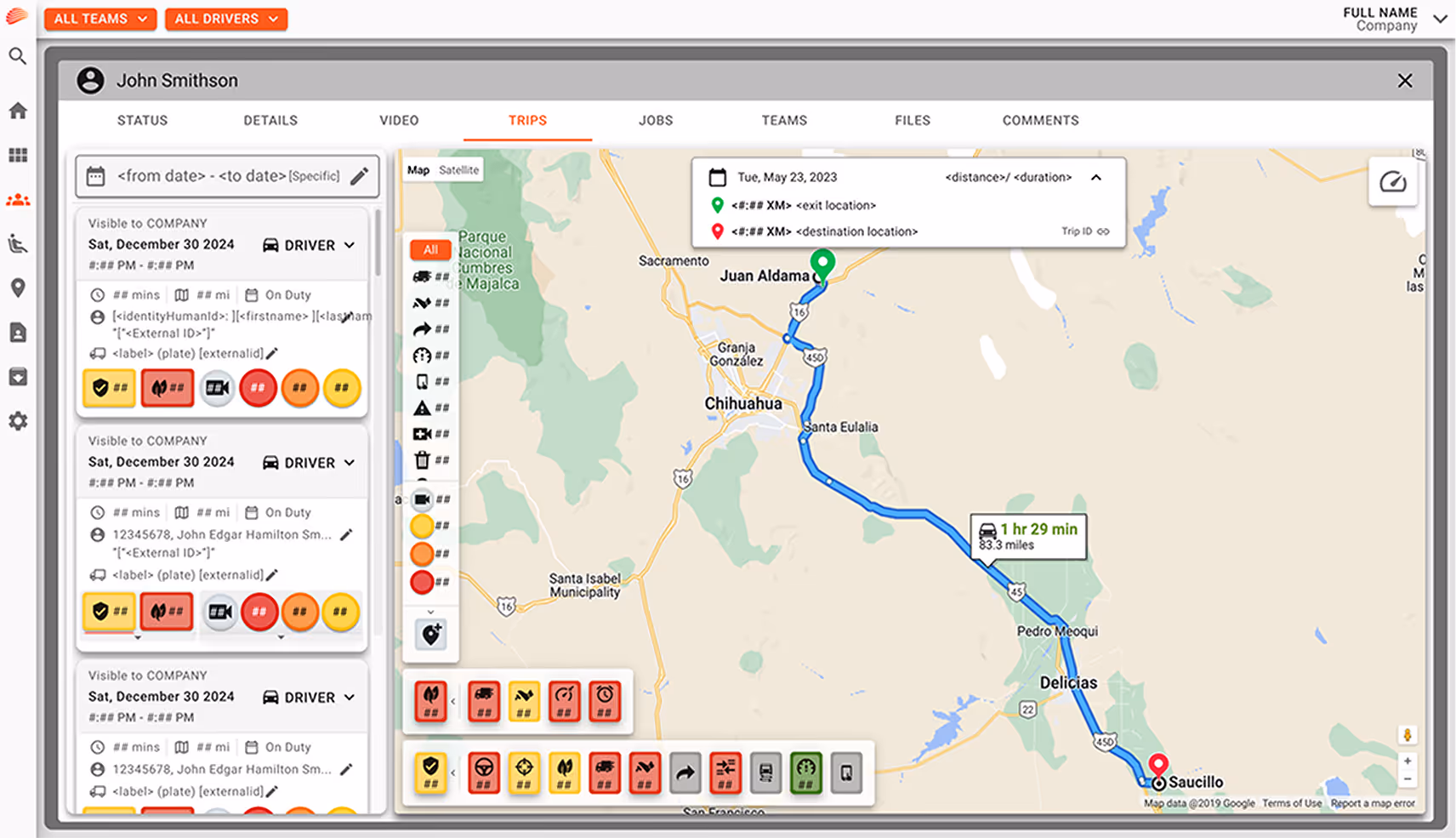
  • Information Overload and Lack of Prioritization:

    Both the dashboard and other critical pages suffered from dense data presentation with little hierarchy. Users often had to click through three or more different pages to find a single piece of information. This lack of direct access to key metrics slowed down their workflow and added unnecessary cognitive load.

  • Workflow Disruption and Task Friction:

    Users—especially operations managers—struggled to complete frequent tasks quickly and often relied on workarounds or external tools.

Design Approach

The first phase of this work was focused on creating a modular performance dashboard. I designed a layout using flexible, grid-based components—similar to Tetris blocks—that allowed fleet managers to arrange and prioritize data views according to their needs. This dashboard gave users more control over which metrics were highlighted, improving their ability to make fast, informed decisions.

In a separate initiative, I joined a redesign effort targeting several high-impact pages of the platform. Unlike the dashboard, this phase emphasized simplification, consistency, and better access to information. I worked closely with product managers and developers to evaluate the structure of legacy pages, define clear information hierarchies, and build a more unified and responsive interface that aligned with users' workflows and business priorities.

What We Learned

  1. • Customization and control empower decision-making for fleet managers

  2. • Redesigned web app pages including event views, job lists, and open tasks

  3. • Responsive layouts, UI components, and reusable patterns built into the design system

What Was Delivered

  1. • Modular dashboard interface using flexible grid-based components

  2. • Reducing the number of steps to access information directly improves efficiency and user satisfaction

  3. • A shared visual system boosts both user confidence and dev team alignment

Results & Business Impact

The redesign was fully implemented and enhanced the platform’s usability, accessibility, and internal workflow clarity. Teams reported smoother navigation and more efficient decision-making. The system updates became a model for scaling design improvements across the broader platform.

  • 1. 40% faster access to key insights.

  • 2. Improved user satisfaction score from fleet managers and directors.

  • 3. Positive impact on client retention, as reported by the commercial team.

  • 4. Established a design framework that has been extended to other pages of the platform.

Want to see the dashboard in action? Explore it on Tourmo's website.

"The simplified dashboard makes it so much easier to track performance in real time. Engagement has definitely increased since the update."

National Food Distributor

Operations Manager

“Tourmo’s AutoPilot platform has made a big difference in our employee engagement and satisfaction.”

A top 50 U.S. company with 20,000+ users.

VP Operations

"This update has been a major step forward. We’re enabling users to get to key insights faster, and that’s resulting in higher retention rates and stronger relationships with our clients."

Key Tourmo Reseller

CEO

Discover More Case Studies

Platform-Wide Redesign Impact

After the successful dashboard launch, we began applying the redesign across other areas. The examples below offer a glimpse into that evolving process.