Understanding the Challenge
The previous version of the mobile app had significant usability, accessibility, and visual consistency issues. Users, primarily fleet drivers, found it difficult to locate key information quickly, which negatively impacted their efficiency on the road. The interface lacked clarity, making navigation cumbersome and slowing down decision-making. Managers also required access to critical insights but faced similar challenges.
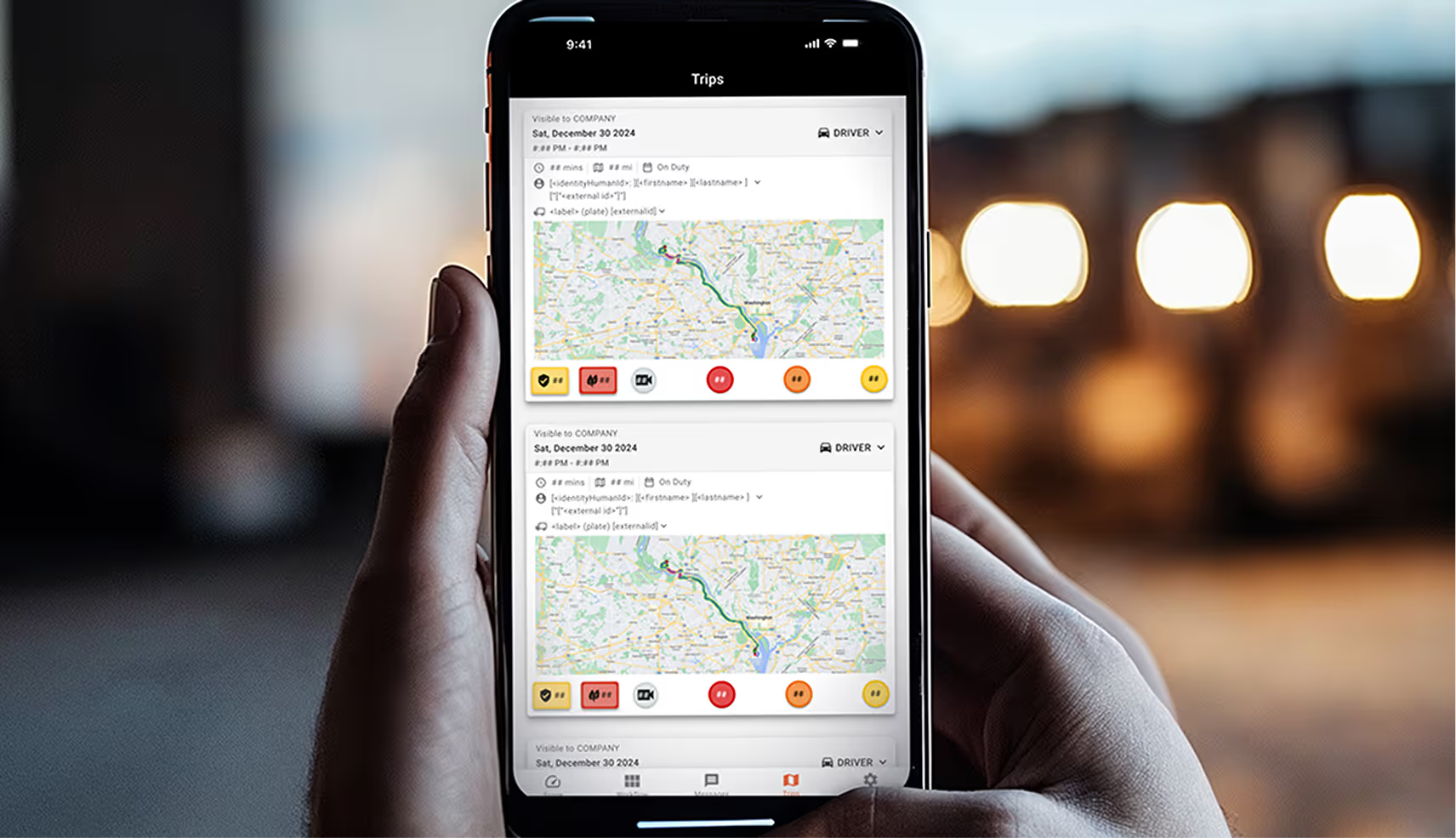
One of the primary issues for drivers was understanding how data was displayed and interpreting it correctly. The lack of clarity in data presentation led to confusion, making it difficult for them to take immediate action when needed. For managers, the challenge was similar, but their primary goal within the app was to find and analyze information to coach drivers effectively. However, the way data was structured and visualized made it difficult to extract insights, creating inefficiencies in the coaching process.
The redesign aimed to address both functional and visual improvements, ensuring an intuitive, easy-to-use experience tailored to both drivers and managers. The key goals were to:

Improve usability with a cleaner, more structured interface.
Enhance accessibility by refining contrast, typography, and touch targets.
Ensure visual consistency with the web platform while maintaining mobile-specific optimizations.
Present data in a clearer, more actionable format to improve decision-making for both drivers and managers.